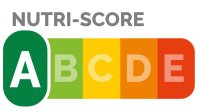
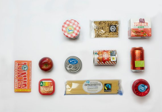
Half the population of the Netherlands is overweight. Which is why the National Prevention Agreement includes the introduction by the government of a food choice logo in 2020, aimed at nudging people towards healthier diets. State Secretary for Health, Welfare and Sports Blokhuis made the decision at the end of November, opting for the Nutri-score, a kind of energy label for food developed in France and used in Belgium, Germany and Spain. It wasn’t an easy decision: nutritionists are critical of the Nutri-Score as it diverges on some points from the Dutch guidelines for a healthy diet enshrined in the long-established pie chart De Schijf van Vijf. So 160 scientists wrote to the government, and it was decided to get some research done on how to align the logo better with the Dutch guidelines before introducing it.
Failure of the tick
The Nutri-score is not the first food choice logo to be launched in the Netherlands. We’ve already had the ‘Conscious Choice’ tick, which was abandoned in 2016 because people didn’t understand it. ‘One problem with the tick was that it assessed products per category,’ says Hans van Trijp, professor of Marketing and Consumer Behaviour. ‘That might help you buy the healthiest mayonnaise, but mayonnaise is still an unhealthy product. It’s difficult to explain that. And the tick was not obligatory either, making it hard for the consumer to know whether a product without the logo was unhealthy or just came from a producer that didn’t adopt the logo. On top of that, people were suspicious because the tick was introduced and financed by the food industry itself.’
We shouldn’t overestimate the effect of logo’s
So the tick was a flop, and we have seen numerous other food choice logos come and go without success. So do such logos work at all? ‘We shouldn’t overestimate the effect of logos,’ says Van Trijp. ‘There is no conclusive evidence that consumers really start buying and eating healthier products thanks to food choice logos. Our studies show that most consumers in a supermarket pay attention to all kinds of things, but not so much to logos and consumer labels. They only do that if you ask them to choose a healthy product. Otherwise they are more guided by other features such as price, flavour and convenience. Seriously overweight people are not usually among those who do pay attention to logos, so logos are not the solution for people in that category. A food choice logo is mainly of use to people who are already motivated to make healthy choices.’
A for apple sauce
Logos can help consumers choose what to buy in various ways. Health logos such as Keyhole, used in countries including Norway and Sweden, or Healthy Choice, which is similar to the Dutch tick, show which products are the healthier option within a particular category. Van Trijp: ‘You can’t use these logos to compare products from different categories, but they do make it easier to pick a healthier option per category.’ This is useful for consumers who scan the shelves briefly to make a choice. But it carries a risk of the ‘halo effect’, whereby the product seems healthier than it is and consumers eat more of it than they would if it didn’t bear a logo.
Besides health logos, there are logos such as the new Nutri-score or the UK’s Traffic Light system, which evaluate each product separately. This has the advantage that the consumer has some way of comparing different kinds of products. ‘But it can cause confusion too,’ says Van Trijp, ‘especially if a product comes out as healthier than expected, as sometimes happens with the Nutri-Score. A pizza can score higher than tea, for example. And in the French Nutri-score, apple sauce, which is full of sugar, gets the same A score as apples. So it is important to sort this out before Nutri-score is introduced in the Netherlands, otherwise consumers will have no faith in it.’
Warning logos
Food choice logos also exist that focus on the negative health impact of a product. These are used in countries including Israel and Chile, where red and black logos are used respectively to indicate that a product is unhealthy. Erica van Herpen, associate professor of Marketing and Consumer Behaviour, studied the effect of these warning logos in Chile, where they have been in use for about 18 months now. ‘We compared the purchasing behaviour of Chilean consumers three years before and 18 months after the introduction of the logo. The logo appears to be effective, because people really did make healthier purchases, even long-term. This applied mainly to middle-class households and those with children, and less so to people on low incomes, who probably can’t afford to buy healthier products.’ Van Herpen is not jumping to any conclusions, because relatively few studies have been done on this yet.
Cause of the logo the product could seem healthier than it is
It is unlikely that there will ever be a black sticker on jars of mayonnaise in the Netherlands. According to European legislation, national governments may introduce food choice logos but it is not compulsory to use them.
Trust
So there is no ‘one-size-fits-all’ logo, but there are a few criteria that a good food choice logo should meet, as a minimum. ‘It’s got to be easy to understand at a glance, for instance,’ says Van Herpen. ‘If people get too much information, it won’t work.’ The Nutri-score is an overall assessment, so it doesn’t immediately tell you what is healthy and what is unhealthy. Van Herpen: ‘The downside is that the information is less detailed. So people who are looking for particular information, like salt levels for instance, will still have to read what’s on the back. Whereas warning logos do show you straightaway that a product contains too much salt, fat or sugar.’ A good food choice logo should also be recognizable. Nutri-score does well there, says Van Trijp, because it looks like an energy label. But the biggest factor for success is whether consumers trust a food choice logo. Van Trijp: ‘Studies show that consumers are more likely to trust the recommendations of this kind of logo if they match the ideas they already have about what is healthy. If there are discrepancies, they have more faith in their own judgement.’ This makes good communication crucial, he says, especially given that consumer confidence is not particularly strong at the moment. ‘I think you can build this trust by communicating in a calmer, less black-and-white way about nutrition. The most important thing is to eat healthily in general, in which case you can afford to be “sinful” now and then and put a product with a red score in your trolley.’
Something to hide
Will the Nutri-score be a success? ‘Only if it is on all products,’ says Van Trijp. ‘For now it looks as though companies are going to be allowed to decide for themselves whether to use the logo. So we’ll have to see you takes the lead on it. I do think that in the long term it will be hard for manufacturers to avoid it, because that will make them look as though they’ve got something to hide. In this sense, the Nutri-score provides an incentive for manufacturers to make healthier, more sustainable products, in the same way that the Fairtrade and the Better Life animal welfare labels led to big improvements in those areas.’
Then there is still the potential stumbling block that the Nutri-score focuses on ingredients and nutrients, while the Dutch pie chart, De Schijf van Vijf, looks at products that fit into a healthy diet. Van Trijp: ‘If we adapt the Nutri-score to the Dutch dietary guidelines, we’ll probably end up with a situation in which exactly the same product is on the shelves in Baarle-Nassau as in Baarle-Hertog a few hundred metres away on the other side of the Belgian border, but with a different Nutri-score because the Belgians have different eating habits to the Dutch. That is confusing, so I think it would be good if we took the same line internationally. Otherwise the government will have to have a very good explanation for such discrepancies.’
Tasty and healthy
Whether this kind of food choice logo will make us switch to a healthier diet is another matter. ‘Logos alone are not enough to bring about behaviour change,’ says Van Herpen. Which is logical, since a logo the size of a postage stamp is just one bit of input in the huge jungle of information all around us. Van Trijp: ‘People do want a healthier product, but only if it is tasty. The tricky thing is that the Nutri-score is based on fat, sugar and salt – precisely the things we enjoy. And it is human nature to go for short-term rewards, namely tasty food, instead of long-term benefits such as health. It is not enough to say: “This is unhealthy, make up your own mind.” Consumers need some idea what to do. There is a big need for healthy products that are also both affordable and tasty.’
People do want a healthier product, but only if it is tasty
New norm
More will have to be done before consumers can be persuaded to choose healthy options. ‘You would rather see healthy products displayed prominently, and unhealthy ones tucked away in a corner,’ says Van Herpen. But in reality it’s the other way round. ‘There are entire aisles full of crisps and chocolate, even though we know that products that are given more shelf space sell better.’
There is not much point in banning unhealthy products, says van Trijp. ‘You can see that now with the reduction of the speed limit: take something away from people and they dig their heels in. It would be better to look at how you motivate people to make healthier choices. Up to now, the main approach has been through information campaigns and education, but that has a fairly limited impact.’ According to Van Trijp, healthy needs to become the new normal. He already has an idea about how to speed up that process. ‘It will be easier to eat healthily if there are not as many unhealthy products on the shelves. So I suggest that supermarkets look at the Nutri-scores of products every year, and give the producers of the lowest scoring 10 products time to improve them, or else they will be taken off the shelves.’

About nutri-score
The Nutri-score assesses products on the calories, sugars, saturated fat, salt, protein, fibre, fruit, vegetables and nuts they contain. The final score consists of letters and colours from A (green) to E (red). The goal is to have the logo on packaging from mid-2021.

